
Inquiry Writeup Format  |
|
Inquiry Writeup Format Planning A | Planning B | Data Collection | Data Manipulation | Conclusion/Analysis | Significant Digits | Statistics | Graphing | Tables | Diagrams | Line Graph | Bar Graph | Sample Conclusion | General Writeup Methods : * Write your inquiry in the 3rd person rather than the 1st person. Example- "The contents of the test tube were mixed incorrectly." is much preferred to "John was a klutz and mixed the wrong chemicals.". * Use sub-headings to organize your inquiry. Example- Introduction, Question, Hypothesis, Variables, Materials, etc..... * Use labeled diagrams to aid descriptions if needed. Introduction: Background info that sets the tone for the experiment. Question Hypothesis: Write a detailed explanation of why your hypothesis will occur. Variables: Indicate independent & dependent variables, positive & negative controls if appropriate, and all variables to keep constant. Title : The title is most likely your question written as a statement. Background Info/ Introduction :
Question :
Hypothesis :
If ________(IV) is _________(describe change), then the _________(DV) will _______(describe effect).
Variables :
List steps which show a method that controls the variables & collects sufficient relative data. Materials :
Procedure:
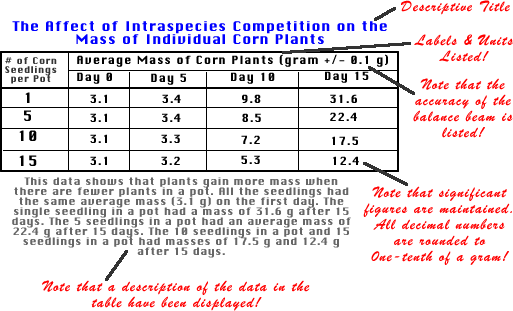
Tables: Show raw data, may show processed data too. Write a detailed title, include all column labels and units. Include uncertainties for each unit. Drawings: Some data may be in drawing form. Drawings should be as accurate as possible, neat, with title and labels.
Example:
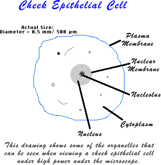
Using Diagrams to Display Data The following are general rules that should be applied to all diagrams:
Example:
The diagram above helps the reader understand what an epithelial cell observed during a cell lab using a microscope might look like. Cell organelles that have been observed are clearly labeled and a short description is provided. Data Manipulation & Presentation
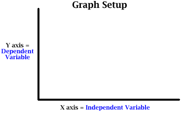
Analysis of Data: Explain any data processing formulas used (averages, standard deviation, mean, mode, median, percent deviation, etc.). Show sample calculations. In writing your lab report, when it comes to the point where you need to analyze your data: 1. Please show any formulas you use. 2. Show one example (using your data) of how to perform the calculations for each formula. Rounding Significant Digits:RoundingWhen calculating significant digits, it is necessary to use proper rounding technique.The rules of rounding are:a. Round only the final answer.b. Carry extra digits on intermediate calculations.c. Consider only one digit past the last significant digit to determine how to round the last digit.d. The digit to the right of 5 rounds to an even number.Examples:* 3.548 rounds to 3.5. (Ignore the 8, just consider the 4. The 5 remains unchanged.)* 3.758 rounds to 3.8. (Ignore the 8, Since 5 rounds to even, the 7 rounds to 8.)* 3.458 rounds to 3.4. (Since rounds to even, the 4 remains because it is even.)UnitsReporting proper units is every bit as important as reporting the correct value. As an example, when reporting water temperature, there is a big difference between 10 F and 10 C. The former is below freezing and the latter is roughly 42 F.Most of the chemical tests will be presented in the units of mg/L. It is also important to specify the chemical constituent you collected data on.Back to topAverage/ Mean: Add each of the numbers within a data set and divide by the number of numbers in the data set. Range: The range reports the difference between the minimum and maximum numbers of a data set. Percent Change: Used to determine amount of change from beginning to end. Useful in comparing different data sets where the starting numbers (or total numbers) are not the same. Rate of Change (Slope of line on Graph) : Determining the slope of the line of a graph helps tell us how one factor ( y-axis) changes in relation to another (x-axis). If the x-axis is time, this change becomes rate of change. Coefficient of Variance: Useful in comparing the accuracy of a set of tests or trials.Correlation Coefficient: Used to determine how closely two different sets of data correlate (Ex: DO & Temp.)Percent Deviation: Used to calculate how accurate student determined data is by comparing it to a known standard or to values determined by an established government lab! This is for Quality Control purposes!Standard Deviation: A measure of the average amount the data deviates from the average of the data set. Often used to determine whether a conclusion that compares 2 sets of data is valid.Reporting Uncertainty in Measured Data: Data is often hard to collect consistently in the same manner, so there is some inherent uncertainty when reporting data. Reporting such uncertainty helps the viewer interpret how accurate the results are, and may help determine whether the data supports the hypothesis or not.Graphs: Choose the best graph form to display data. Include descriptive title, labels and units on both the x- & y- axes, and key if needed. Write a summary below the graph about what the graph is showing. If you want a high score, all of the graphs you turn in should be drawn on graph paper or printed from a computer graphing program! Where to place the dependent and independent variables
If you want the highest IB score: 1. All graphs for all assignments in IB Biology at GHS should be done either on graph paper or on a computer graphing program. 2. You should make your own graph. Copies of other peoples' graphs don't count! 3. All graphs should include a descriptive title (Hint: What does the graph show us?). The title of a graph often is directly related to the experiment title or question! 4. Both the X- and Y- axes should be labeled, each with units where appropriate! 5. If multiple sets of data are present, select data points or colors which show the different data clearly. Provide a key too! 6. Write a sentence to small paragraph below the graph that states what the data shows! Line graphs work well when both the dependent and independent variables represent numerical data.
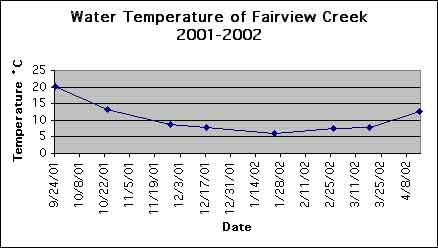
Graph Description: This graph shows how the water temperature of Fairview Creek changed from September 2001 to April 2002. The water temperature dropped from a high of 20¾C in September to a low of 6¾C on January 28, 2002. It slowly raised to a temperature of 13¾C in April 2002. Bar graphs work well when one of the variables does not involve numbers. Examples: Car type vs. gas mileage. Oxygen level vs. stream. Population vs. country
List specific results (like a temperature of 50¾C has a reaction of 4 ml/sec, 60¾C has a reaction of 5 ml/sec.......etc). This data should represent an average, or processed data. Compare your results to your hypothesis. How are they similar? How are they different? Explain results. List potential problems with your experiment. (Take notes of problems during the experiment. Look at your list of variables to keep constant. This is a great source of potential problems!) Consider sources of human error, the accuracy of the equipment used List possible solutions to the potential problems listed above. How could you make it more likely that these variables are kept constant? Sample Conclusion & Evaluation
Sample #1: Does Temperature Affect the Activity of Fruit Flies? At a temperature of 3¾C, no flies were active. At 8¾C, 110 fruit flies were active. At 15¾C, 130 fruit flies were active. At 23¾C (room temperature, 130 fruit flies were active. At 31¾C, 130 fruit flies were active. At 40¾C, 99 fruit flies were active. The original hypothesis stated that no fruit flies would be active at or near 0¾C, and that the number of fruit flies moving would increase as the temperature increased. The results partially support the hypothesis. The results show that the number of fruit flies that are active increases from none at 3¾C to 130 in motion at 31¾C. The number of fruitfliesthat were in motion increased as the temperature increased because they are cold blooded. The chemical reactions that occur in their bodies are dependent up the temperature of their surroundings. Chemical reactions occur more slowly at lower temperatures because the molecules involved are moving slower, thus having a lesser chance of colliding, and colliding with lesser force. The reactions thus slow down. As the temperature increases, the molecules move faster and thus have a greater chance to both collide, and also collide with sufficient force to induce a reaction. Ther reaction increases. However, the number of flies in motion dropped at 40¾C to 99. It appeared that 31 fruit flies had died due to the hotter temperature. Perhaps the enzymes and proteins making up the structure of their cells became denatured, thus reducing chemical reactions, and eventually killing the flies. This factor had not been taken into account when writing the hypothesis. Potential Problems with the Procedure and Steps to Improve Each: 1. Only one trial was taken at each temperature. Class results could have been used to increase the validity of the data collection. 2. Several teammates read the temperature from the thermometer. Each teammate could read the thermometer differently. The thermometer should always be viewed from a perpendicular angle. Only one student should read the thermometer, or several students should read the thermometer and reach consensus on the temperature reading. 3. The temperature was read in the water bath. The actual temperature of the test tube in which the fruit flies were kept may have been different. If a one-holed rubber stopper was available, the thermometer could have been inserted through the hole and the stopper and thermometer inserted into the test tube to provide temperature readings that the flies were actually experiencing. 4. There were "wide" gaps in collecting data. The fruit flies were either not active or all active. Testing more temperatures at lower temperatures may have showed how those temperatures affected the flies. Likewise, more temperatures near and above 40¾C could have been tested. If all students started with the same number of fruit flies, the class data could have been used. Each group tested fly activity at different temperatures. Class data could also be used if the data were converted to a ratio of active fruit flies per total number of fruit flies. 5. The definition of fruit fly activity was sometimes difficult to ascertain. At 3¾C, several fruit flies occasionally jerked their legs. Several were perched motionless on the side of the test tube, legs twitching. Were they active? It was noted that fly movements reduced the longer they were exposed to cold temperatures. Likewise, as the temperature warmed up, a number of flies remained motionless (but upright) on the sides of the test tube. Were they active? The test tubes were tapped when this was observed to see if they would move.
|
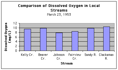 Graph Description: On March 23, 1953, the Clackamas River had the highest Dissolved Oxygen (DO) at 11 mg/L. Beaver Creek and the Sandy River both were second with a DO of 10 mg/L. Kelly Cr had a DO of 9.5 mg/L, Fairview Cr had a DO of 8.5 mg/L, and Johnson Cr had a DO of 8 mg/L.